The importance and rise of brand refreshes: A look at Pepsi's bold makeover
In a year marked by economic uncertainties and shifting consumer behaviours post pandemic, the world of marketing has witnessed a
significant trend: brand refreshes. Many companies, including industry giants like PepsiCo, have embarked on journeys to revitalise their
brands. These refreshes are seen as critical as brands adapt to a changing landscape, bid farewell to old habits, and lay the groundwork for
future marketing success.
Let's explore Pepsi's recent brand refresh as a case study in this era of transformation
Pepsi's Bold Move: A 125th-Anniversary Makeover
Aligning with the brand's 125th anniversary, this milestone signals a turning point for Pepsi, as they gear up for a consumer-facing campaign that will commence in North America, gaining momentum globally in early 2024.
It has been 14 years since the last major brand update. During this period, the digital landscape has undergone significant transformation with the rise of platforms like Netflix and TikTok, prompting Pepsi to rethink its media strategies.
Over the next 10 to 15 years we will see a digital overhaul and acknowledgment of the evolving digital landscape underscores the need for brands to stay agile and adapt to fast-shifting consumer behaviours.
Some brand refreshes involve significant overhauls of visual assets or messaging strategies. These bold changes come from companies looking to maintain their momentum or those seeking a turnaround. Smaller pivots also aim to reintroduce brands to consumers whose tastes and media consumption habits have shifted. Across these efforts, recurring themes include emphasising value, comfort, and a sense of playfulness or self-expression to resonate with audiences in a post pandemic world.

Pepsi's visual transformation: Goodbye to minimalism
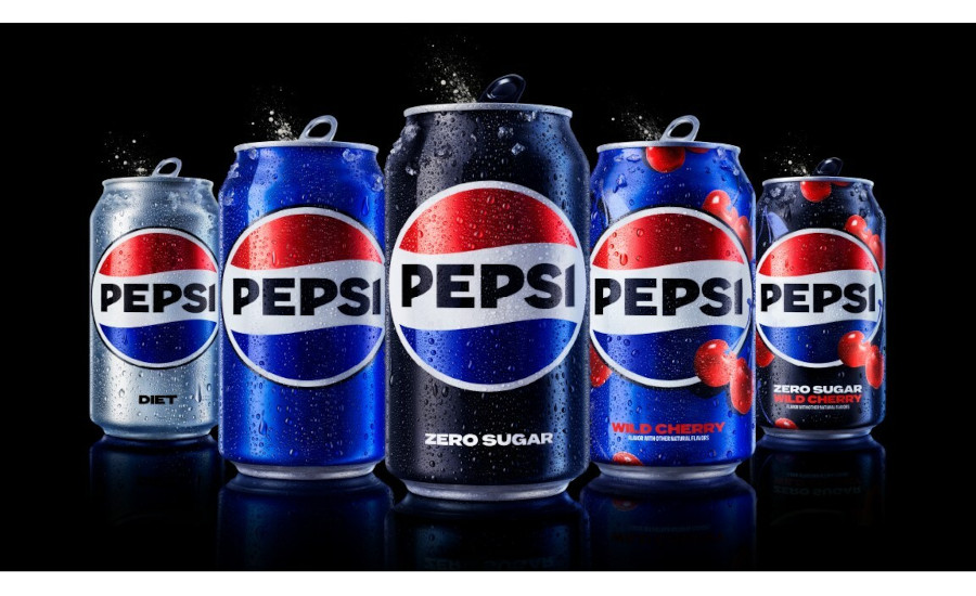
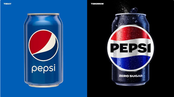
Pepsi's latest makeover represents a departure from the minimalist branding that has dominated its marketing over the past decade. The brand's classic muted blue colour scheme has been replaced by a vibrant electric shade, complemented by sharp black tones to create contrast. This change also highlights Pepsi Zero Sugar as a significant growth driver within the portfolio.
One noticeable change is the relocation of the word "Pepsi" inside the globe-shaped logo. This shift enhances cohesion and flexibility while paying homage to past brand iterations. The new "wordmark" features a bold custom typeface, replacing the soft, lowercase letters of the previous version.
The importance of brand refreshes
Pepsi's bold brand refresh serves as a reminder of why it is crucial to consider a brand makeover when your visual identity no longer aligns with the company's current identity and objectives. In a rapidly changing world, brands must evolve to remain relevant and connect with their target audiences effectively. A refreshed brand can reignite consumer interest, reinvigorate brand loyalty, and position a company for long-term success in a dynamic market.
As we witness a surge in brand refreshes across industries, it becomes evident that adaptability and a willingness to embrace change are essential for brands looking to thrive in the ever-evolving landscape of marketing.
If you think your brand may benefit from a refresh, talk to 2 Creative Media today.

